This is a new series, where I will attempt to give a little run down of games I am playing and how accessible I find them to be. Coming from the viewpoint of someone who is legally blind and has ADHD/Autism. These mini reviews won’t be about the quality of the game as a whole, nor can I accurately cover everyone’s accessibility needs. I just hope this helps some.
First up we have Days of Doom, a tactical, turn-based tactics, RPG, roguelite. A genre I have found myself more and more interested in as my vision has deteriorated. Mainly due to the slower pace, that allows me to use a system’s built in screen-zoom features, or let me ask someone to guide me if needed.
Unlike a faster paced game, such as an FPS, it doesn’t ruin a session if I need to stop suddenly due to my issues. Anyway, enough about my specifically. What does Days of Doom do well and where does it need to improve.
First up, the settings are as basic as they come. Resolution, VSync, sound options, language and that is about it. There is no UI or font scaling options, nor colourblind modes. Just bog standard ‘console’ options. It is a real disappointment as honestly any game that relies on a UI as much as this genre, these options should be as standard.
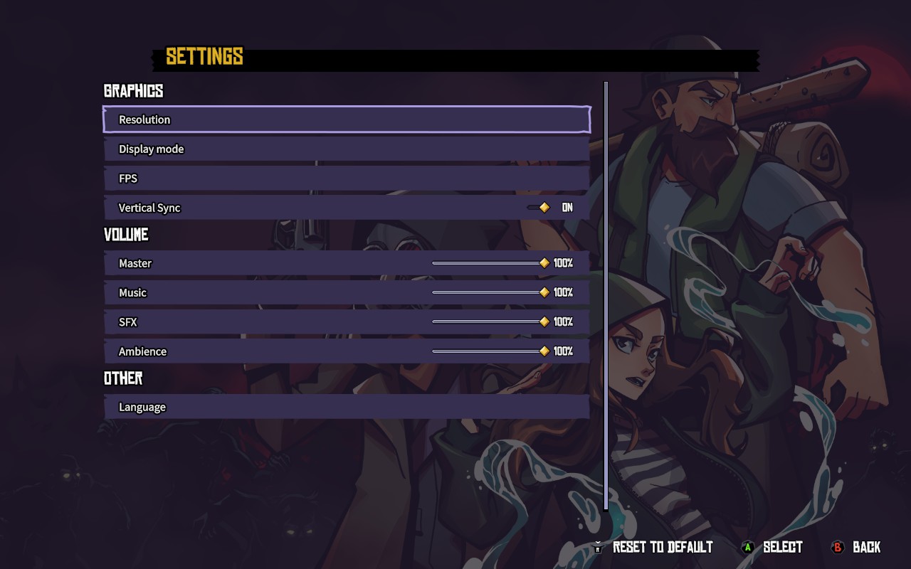
I could be willing to give a bit of a pass, as the text size even on Steam Deck by default isn’t the worst in terms of scaling. In actual fact it is pretty readable if I use Steam Deck’s system wide magnifier, which I set to a touch of the left trackpad to toggle. However the choice of font gives the text a fuzzy feel which in turn makes it all sort of bleed into itself.
Now the UI itself is pretty good. As someone with ADHD, I can get overwhelmed by a bombardment of UI elements that make the game confusing. Here though the screen is pretty simple to understand. Top left you have turn order and unit health. Then at the bottom the action you are performing, with a description and clear indicator of the amount of AP it takes to perform and what you have left.
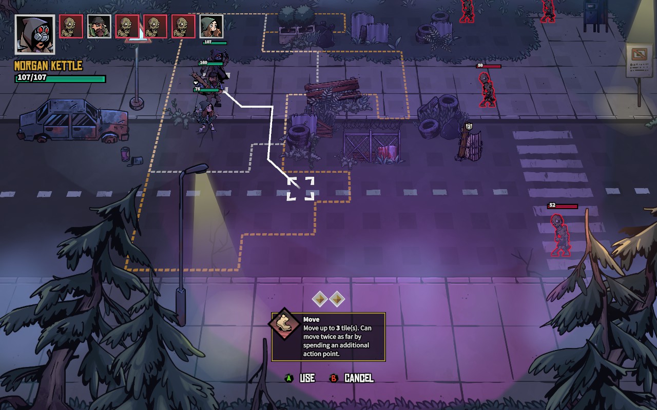
However whilst the Ui is clean and easy to follow, the battlefield is anything but. For a game that has ‘cartoon’ or ‘comic’ style visuals, everything is a bit bland and non-distinctive. Which meant I struggled to see who was where on the battlefield at all times. Which would lead to some mistakes.
Now, this is where accessibility options become a must and should be as standard in games like this. The zombies (as seen in screenshots) have a red outline, but with them being dark and the scene itself not being too different, I found it very difficult to see and therefore plan properly.
Added to this, is that whilst there is a turn order, I found it very difficult to see which of the generic enemies was next to act, as they are a bit cut and paste. As well as I found no way to select an enemy unit and see their potential movement range. Something I think is vital in such a game.
It is a shame as Days of Doom is a very decent stab at the genre and one I wanted to get behind. I do feel that a bit of work on accessibility options could address a fair few of the issues. Especially as this is one of the easier games in the genre to pick up and play and not feel bogged down by a convoluted system to manage a party. The party management here is nice and simple, allowing focus on the meat of the game, the turn-based elements.
I hope it is something SneakyBox can look into and address. If not for Days of Doom, but for whatever they do next.