Look, when it comes to ‘simulator’ games, I do generally leave my expectation in check. I appreciate the jank within many of them. Hell, it is even part of the charm. So I was quite looking forward to trying Train Station Renovation.
Underneath some major issues that I will get to, there is quite a charming game that should offer a relaxing experience as you progress through a ‘career’ of fixing up old and run-down train stations. I mean, the game is going full Ronseal here. You do the job, earn funds, build your train track diorama, rinse and repeat.
Honestly, the idea is fine. It should be up there with the likes of Power Wash Simulator as a fun throwaway experience. However, several major issues stopped me from getting any enjoyment from the game at all. All of these come down to accessibility.
First off are the controls themselves. I am not sure if the developers have ever met a human being before. But it appears the beings they have met have an extra arm and hand. As a result, it is almost impossible to play Train Station Renovation handheld. Many of the tasks require you to hold down the ‘A’ button whilst also aiming with the right stick.
Something as simple as picking up trash and putting it in a skip required me to hold the Switch in a way that wasn’t natural. Then the others tasks, such as painting, sanding, brushing, etc., all require holding A and moving the right stick, with some also needing me to move with the left stick.
It rendered the most basic of tasks infuriating. This was just within the tutorial level (which is oddly placed in itself, but more on that later). I looked to see if there were any options to change how the controls work. Something as simple as the A being a toggle rather than needing to be held. At best, allowing me to rebind as I see fit. However, there was none of that, just a screen that informed me of the controls.
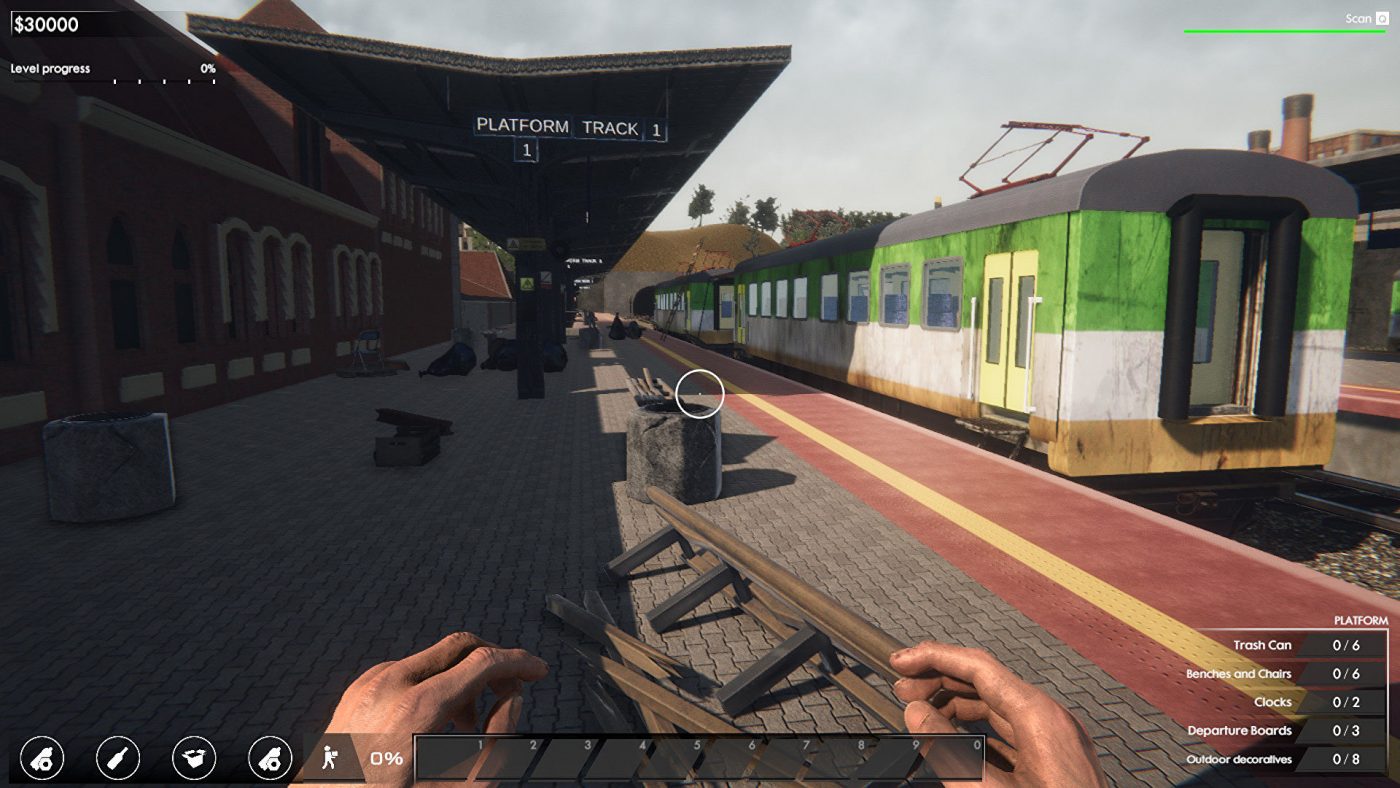
So I persevered as best I could and ran into more accessibility issues. This one is far from exclusive to Train Station Renovation, but it needs mentioning. The text is tiny and almost unreadable, especially when in certain menus vital for game progression. It is a blight that needs to be addressed on the whole.
The UI itself was not designed with any accessibility in mind at all. Various shades of brown and green were difficult for me to follow, so I hate to imagine how someone who is colourblind would cope. UI is vital to a good user experience; therefore, it needs to be clear what item you are selecting at any time, especially in a game requiring you to handle a budget.
In the tutorial, I had to select a bench in the tutorial itself, but I couldn’t find the right area in the menus to get there and buy it. It was functional in that the menu worked, but it was way too difficult for me to concentrate on what was what. Which is also something the overall structure of the game suffers from.
You are dumped in with no exposition and left to just kind of get on with it. I stumbled upon the tutorial, but that was after I accidentally tried clicking around a train diorama, thinking that was the way you accessed various levels. I found something on a desk that briefly highlighted as a tutorial and did that. Again though, it did nothing to guide me into the game properly. Yes, it gave an overview of the interaction mechanics, but that was it.
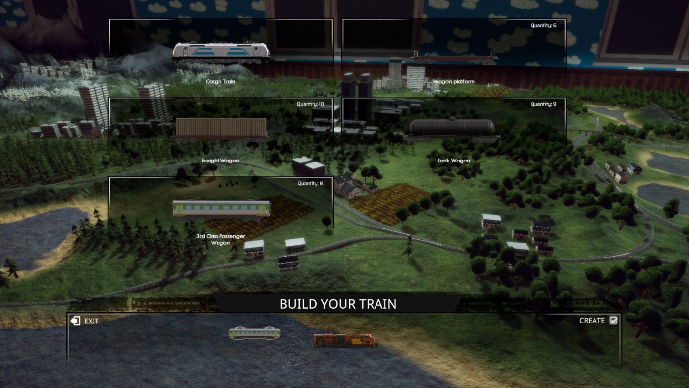
Now don’t get me wrong, I have played games that drop you in and leave you to it, but they are cleverly designed so that you are still onboarded in some fashion. Unfortunately, that wasn’t the case here. I didn’t know where I was to go, what I was meant to do. So instead, I had to trial and error my way through the ‘menu’.
Sometimes, developers want their games to be immersive and have menus that are more ‘real’ than a simple screen with menu items on it. But there is a reason certain things stand the test of time. For example, Train Station Renovation would have been better of with a simple menu on a well-designed background. Or do it all through the computer screen if immersion of some kind is needed.
As I said at the start, there is a good game here somewhere, but I just couldn’t be bothered to put the work in to find it. My ADHD brain got too frustrated and wanted to give up. So I only pushed on to be able to write this. I am not one to say change this and this; it is easy. But If there is the chance of a follow-up game, then some basic accessibility options and some simplicity will go down wonders and allow me to appreciate your game a hell of a lot more.
This isn’t the only example of a game ruined by too many factors outside of the core gameplay, but it is almost a tickbox exercise in how to alienate a large portion of an audience.